
Why Numbers Rarely Matter in Measurement (And What Does).

I was thinking the other day it's ironic how little numbers matter in Measurement. They might mean a bit more in "Analytics" but with Measurement (trends + patterns > accuracy) numbers are almost never important.
Here was an actual example interaction I had with another consultant working with a client of mine. She is largely in charge of email for them (and does a great job).
I proposed we add in a "bot link" to the email to see how many clicks it would get from email bots (something a human would never click). The trick is to add a common to something like the intro of "Hi, {first_name}}".
You can add a "ref=bot" link to URL param so you can figure out # of clicks in GA4 (I like this approach vs UTM'ing it). Also you should totally do this to get a better idea of true "opens"
At a certain point she mentioned there was "92" bot clicks on day one of the send, and then here are the subsequent questions I asked:
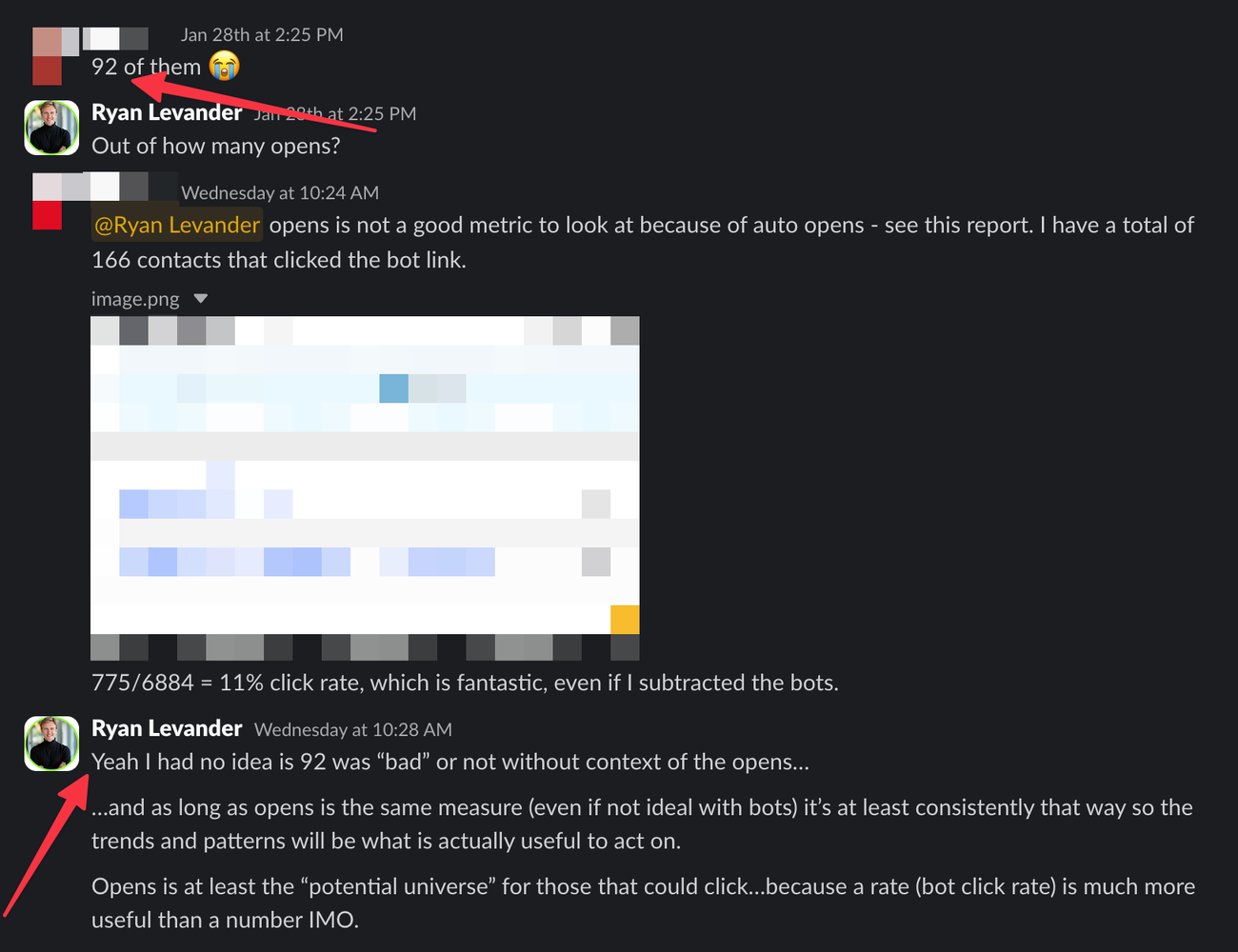
At first 92 sounded like a lot. And earlier in my Marketing career I probably would have said, "Dang! That's a lot" - without asking for more context.
But just think if 100,000 people opened that thing...0.09% would have been a click. Not a concern at all.
Drop a couple zeros off and 9.2% click, starts to seem like a "problem" again...
...context with data is everything. Don't let the #s alone tempt you into forming an opinion without some contextual questions.
The top 3 contextual questions to be asking:
- Compared to last week/last year, how are we doing?
- Compared to other channels, how are we doing?
- Compared to what we thought it was going to be (gold standard)
Examples and visuals of each
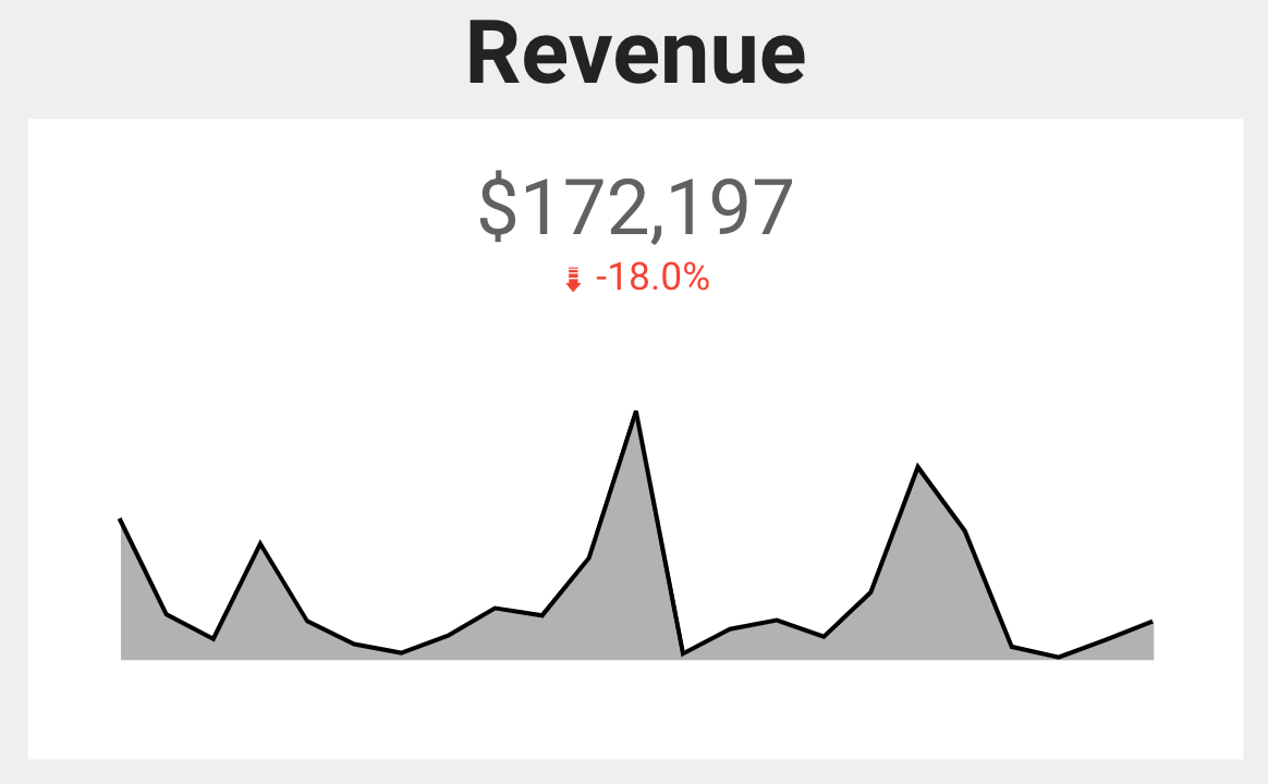
Comparison of time (previous period):
This one is the most obvious and the best place to start.
Comparison of time (previous year):
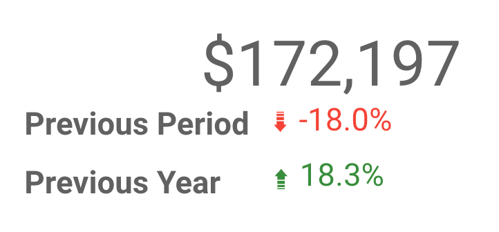
So the trick here is to make sure your Looker Studio layers are positioned correctly so the previous year scorecard is layered behind the previous period scorecard. This way you only see the previous year % change.
Tip: Hold own shift while you use the arrow keys for granular control over moving things to line up perfectly.
Comparison of channels:
Actually what I find most useful is the source, medium, and campaign. Or, the big three as I like to call them 💪🏻
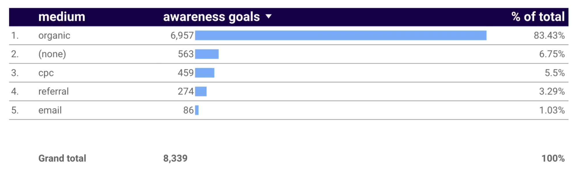
I like to start with "session medium" inside of GA4 as it has the least scoping issues and based on how I measure things (more page level focus and "did this do what it was supposed to do" and less attribution rabbit holes). It takes a more more involved setup, but it shifts the conversation to page optimization instead of "what attribution model should we choose"
When "channels" are used I immediately want to get more granular. Most of the time the clients I work with aren't spending millions a month on ads, so you can absolutely just use session medium to start as it doesn't get that complicated with many rows.
Compared to what we thought it was going to be:
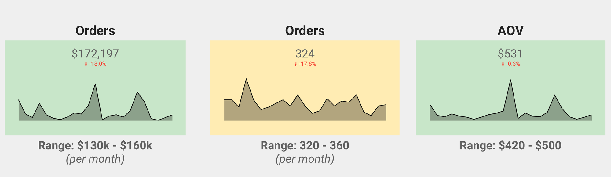
Notice the "range" below each of the scorecards showing what is the expected range.
Pro tip: You should be setting ranges, not individual #s as it's not meant to be a "guess to get it right" - you will always be wrong. Get used to it. That's why we are setting a range here.
Taking it one step further is pre-defining actions ahead of time based on the ranges.
- Above range: We'll look into individual ads leading to success and scale those campaigns.
- In range: Working as expected, look for opportunities to run tests on offers that will influence results greater.
- Below range: Maybe look at pausing campaign(s) that aren't performing well. Look at more page-level data to see where the user is falling off.
And notice the colors of the scorecards in Looker Studio - those are conditionally formatted to show stoplight simple actions:
- Green = above range
- Yellow = in range
- Red = below range
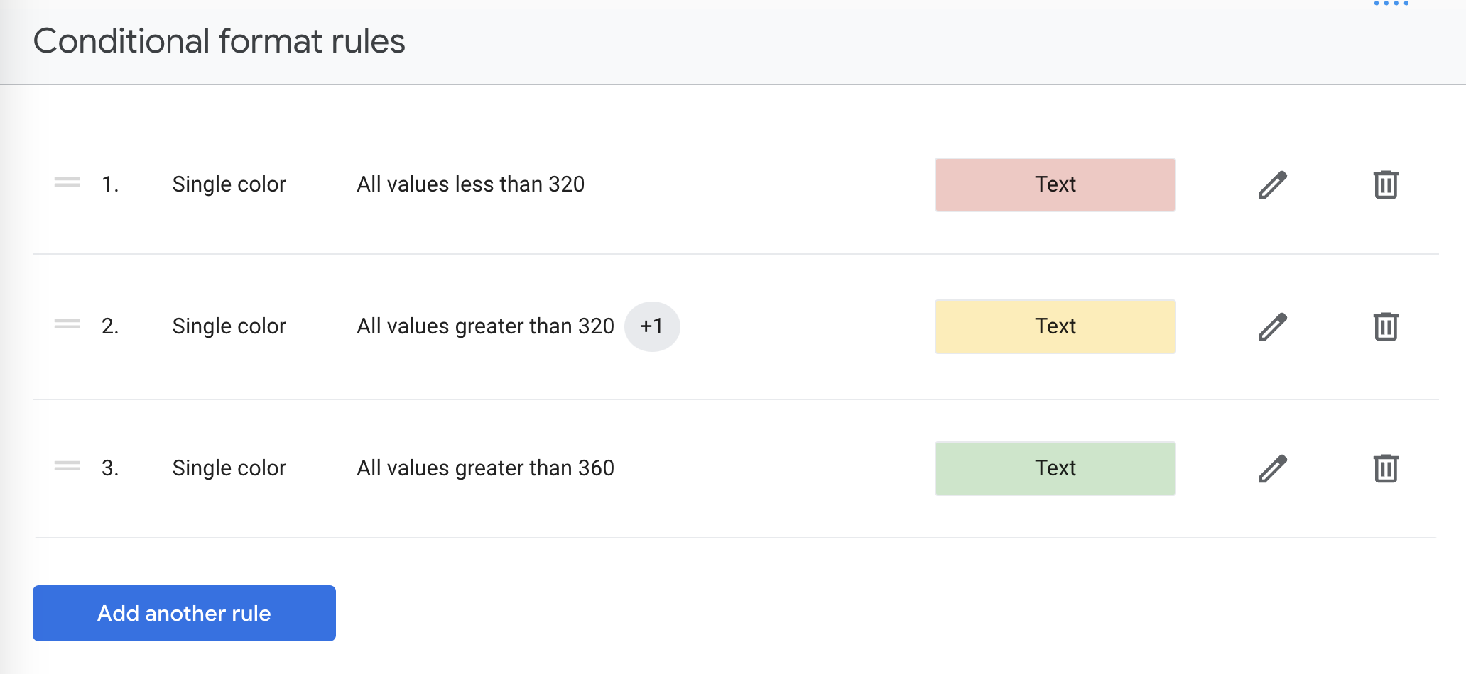
You can set that up to have rules at the chart level in Looker Studio:
Just one more way for a stakeholder to log into your dashboard and see quick insights leading to an action.
Real world analogies to drive my point home
Health: The doctor would never just weigh you and call it a day. This is why body mass index as a proportion to your height makes sense.
Sports: You made 8 three-pointers in the game and almost set a new record, nice! But wait, you took 35 shots to make those 8..? Not so nice! 23% field goal percentage is nothing to brag about.
Work performance: Consider this conversation between a Consultant and a CMO:
CMO: "You only worked for 2 hours? You billed me $10k this month?"
Consultant: "I got done what you wanted, right?"
CMO: "Well, yes. But it only took you 2 hours."
Consultant: "Yes, and it took me 10 years to be able to do what I do in 2 hours. Should I be penalized for it?" 😉
Someone else could work 60 hours in a week, and that might seem like a lot (it is), but that isn't a measure of productivity.
Next time someone gives you a number, ask for more context before sharing a reaction to that!
Member discussion